Background
European Bank’s mobile banking app had grown organically over several years, with features bolted on by different teams without a unifying design system. Customers frequently cited confusing navigation, buried features (like transfers and card controls), and inconsistent visual language across screens in app store reviews and support tickets. App store ratings had plateaued below competitor neobanks, and internal data showed high drop-off during onboarding and card-activation flows.
European Bank brought us in to redesign the core mobile experience end-to-end not a visual refresh, but a rethink of the information architecture and interaction patterns underneath it.
Research & Discovery
Conducted usability testing sessions with existing customers to observe where they struggled in the current app (navigation, transfers, statements)
Analyzed in-app analytics and support ticket data to identify the highest-friction flows by drop-off rate and complaint volume
Ran competitive teardown of neobank and traditional bank apps to benchmark navigation patterns and information density
Conducted card-sorting exercises to restructure the app’s information architecture around how customers actually think about their finances, not how the European Bank’s internal org chart was structured
Interviewed the European Bank’s customer support team to surface the most common “where do I find X” questions
UX/UI Redesign
Restructured primary navigation from a 6-tab structure (mirroring internal product silos) down to a 4-tab structure organized around customer intent: Home, Transfers, Cards, More
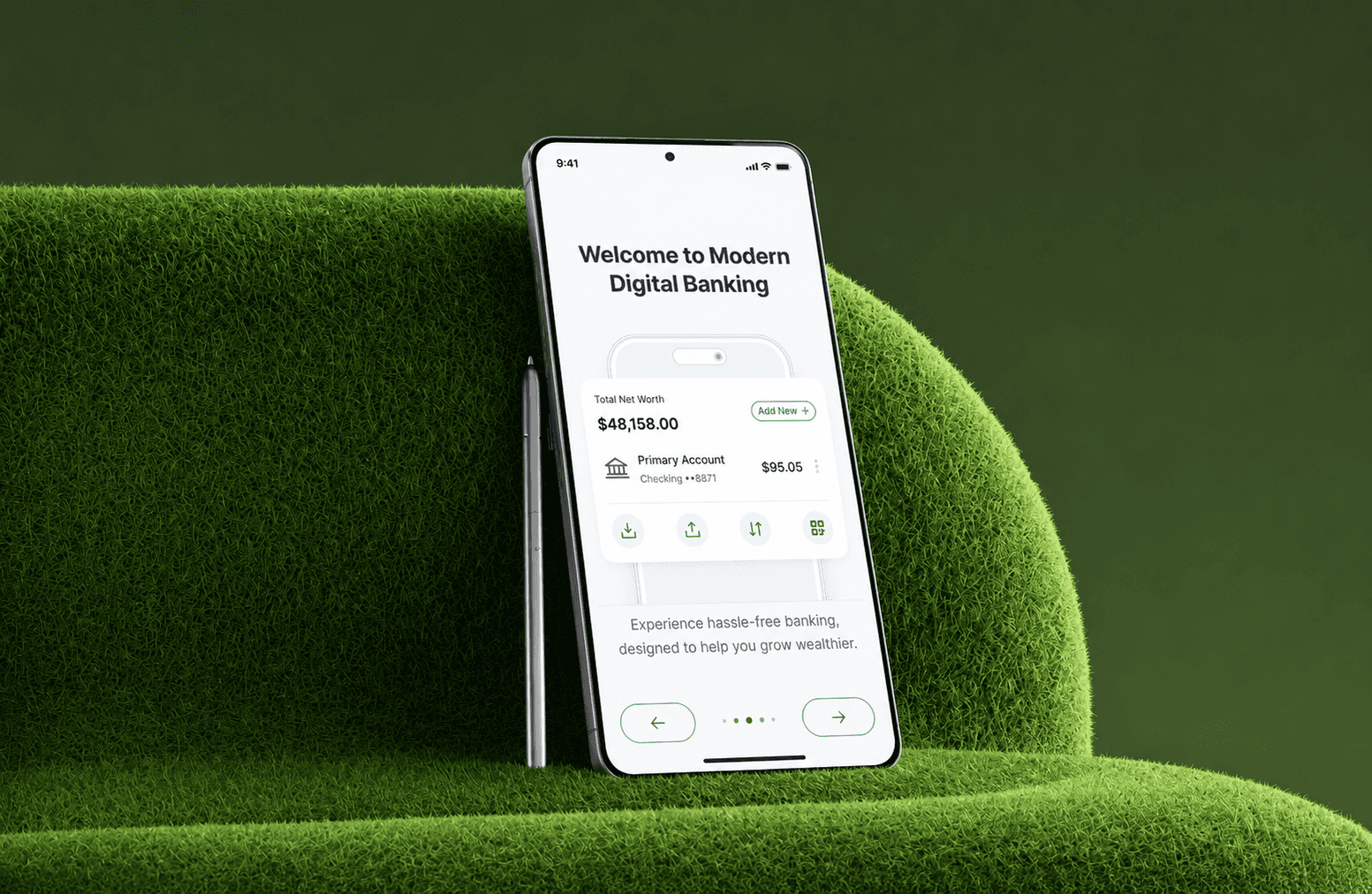
Redesigned the account dashboard to surface balance, recent transactions, and upcoming payments in a single scroll rather than requiring drill-down into separate screens
Rebuilt the transfer flow to reduce the number of steps from 7 screens to 3, with saved payees and smart defaults for repeat transfers
Introduced a unified design system (typography, spacing, color, component library) in Figma and mirrored it in a Storybook component library for engineering
Redesigned card management (freeze/unfreeze, limit adjustment, replacement requests) as a single self-contained flow, previously scattered across three different menus
Added biometric-first authentication as the default login path, with PIN as fallback, replacing a password-first flow that was the single largest source of login-support tickets
Development & Infrastructure Integration
Rebuilt the mobile app’s frontend incrementally in React Native, screen by screen, behind feature flags to allow gradual rollout rather than a single risky cutover
Migrated data-fetching from a legacy REST layer to GraphQL, allowing screens to request exactly the data they needed and reducing over-fetching on slower mobile connections
Instrumented the new flows with Segment analytics from day one so the team could measure the redesign’s impact against the original baseline metrics
Ran the old and new transfer flows in parallel via A/B testing for three weeks before fully deprecating the legacy flow
Built the new component library to be theme-able, anticipating the European Bank’s future need for white-label or regional app variants
Technical Challenges & How We Solved Them
Legacy REST dependencies mid-migration Several backend services only exposed REST endpoints, complicating the move to GraphQL. We stood up a GraphQL gateway layer that wrapped legacy REST services, letting the frontend consume a consistent GraphQL schema while backend migration continued independently.
Feature-flag complexity during incremental rollout Running old and new navigation simultaneously for different user cohorts created edge cases in deep-linking and push notifications. We built a routing abstraction layer that resolved links against the user’s active flag state, rather than hardcoding navigation targets.
Biometric auth fallback edge cases Some older devices had inconsistent biometric API support. We implemented device capability detection at login with a graceful fallback to PIN, tested across the European Bank’s top 20 supported device models.
Design system adoption lag Engineering initially continued referencing old style constants out of habit. We enforced adoption via Storybook visual regression tests in CI, blocking PRs that introduced components outside the design system.
Key Features
Simplified 4-Tab Navigation reorganized around customer intent instead of internal product structure.
Unified Account Dashboard balance, transactions, and upcoming payments in a single scrollable view.
3-Step Transfer Flow reduced from 7 screens, with saved payees and smart defaults.
Consolidated Card Controls freeze, limits, and replacement in one flow instead of three separate menus.
Biometric-First Login faster, lower-friction authentication with PIN fallback.
Theme-able Component Library shared design system built for future white-label/regional variants.
Impact
The redesign directly targeted the highest-friction points identified in discovery navigation confusion, a bloated transfer flow, and scattered card controls and replaced them with flows validated through usability testing before full rollout. Because the new experience shipped incrementally behind feature flags, the European Bank was able to catch and fix issues with small user cohorts before they affected the full customer base.
Outcomes:
Transfer flow completion time reduced substantially after moving from 7 screens to 3
Login-related support tickets dropped significantly following the shift to biometric-first authentication
App store rating improved measurably in the months following full rollout
Card-management related support tickets decreased after consolidating previously scattered flows
Design system adoption gave engineering a documented, reusable component library for future feature work
Client Feedback
“Our customers had been telling us the app felt like five different apps stitched together, because internally, it kind of was. The redesign finally made the experience match how people actually think about their money.”
Head of Digital Banking, the European Bank
Conclusion
The Digital Banking UX Redesign addressed the underlying information architecture problems behind the European Bank’s customer complaints, rather than applying a surface-level visual refresh. By pairing structured discovery with an incremental, feature-flagged rollout, the European Bank was able to validate improvements against real usage data before fully committing to the new experience reducing rollout risk while meaningfully improving day-to-day usability.