How We Started
The idea behind the Puritya redesign was to refresh the brand’s digital presence with a modern, intuitive interface that better reflects its values of purity, wellness, and trust. Our goal was to enhance user experience, streamline navigation, and elevate the visual identity—without losing the brand’s original essence.
Project Process
Research & Evaluation
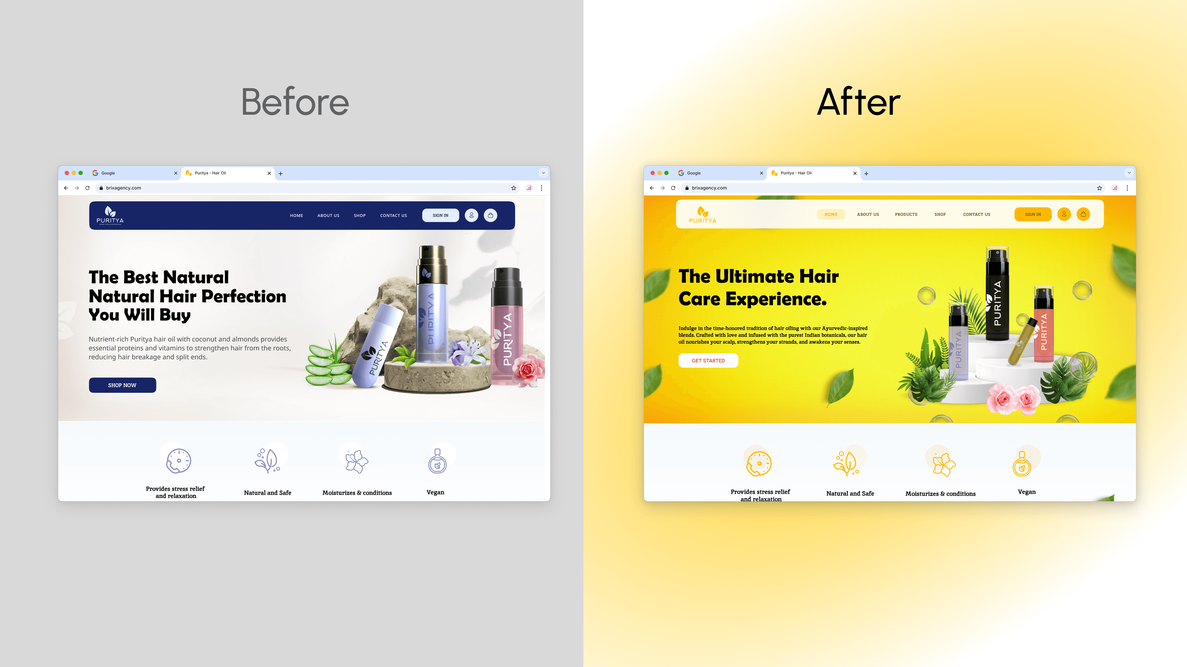
We began by auditing the existing website to identify friction points in user experience, outdated design patterns, and inconsistencies in branding. Competitor analysis and user feedback helped us define clear goals for the redesign.
UI/UX Redesign
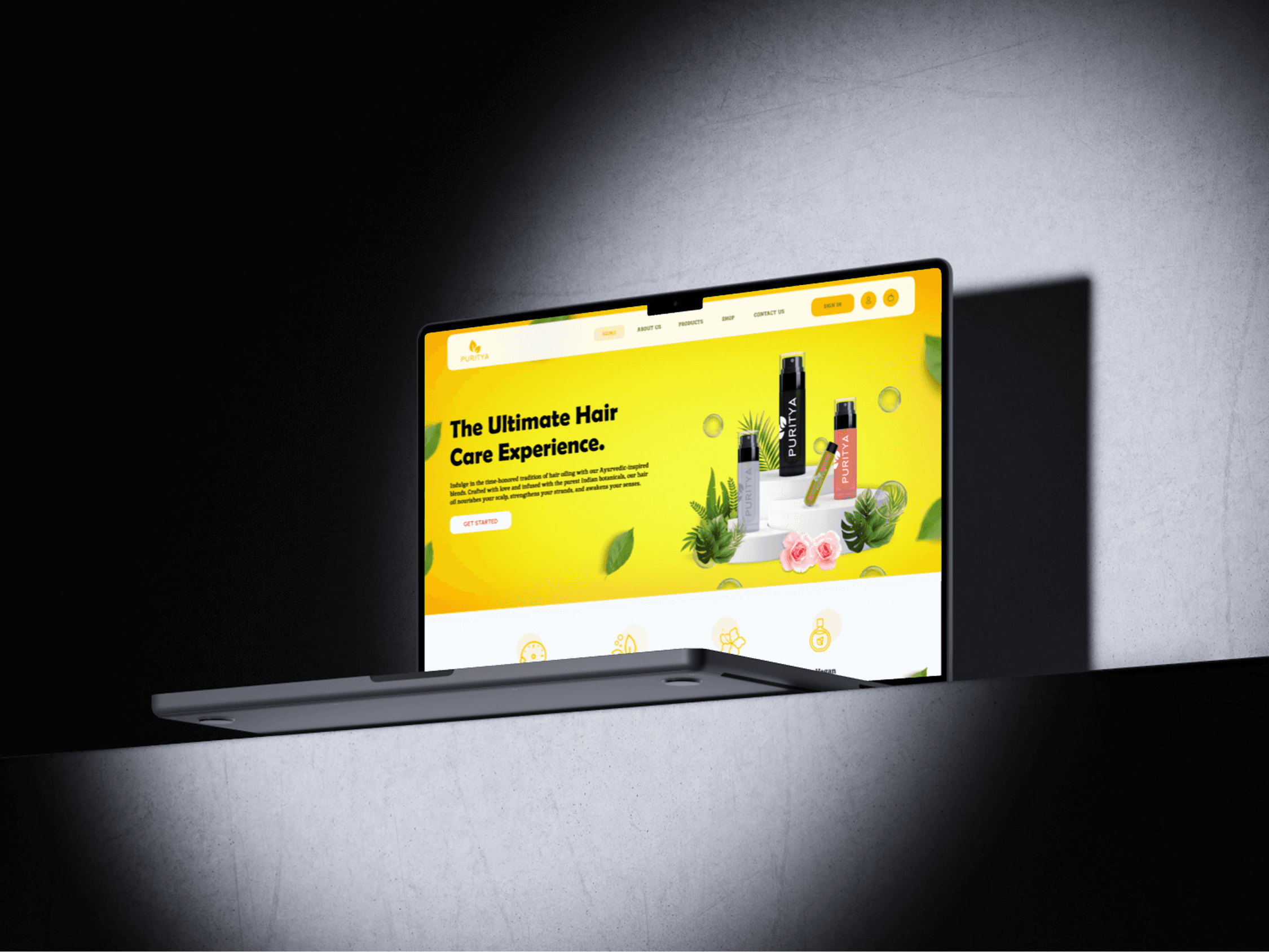
Using Figma, we reimagined the visual style and user journey across the site. Focused on calm, clean layouts and user-friendly interactions, the updated design brought Puritya’s wellness-first philosophy to life through thoughtful typography, color palettes, and intuitive components.
Improved Architecture & Optimisation
We restructured the website’s information architecture for easier navigation and a smoother user flow. Key areas like product pages, testimonials, and subscription options were redesigned with conversion and clarity in mind. The updated layout was tested across devices for consistency and speed.
Key Features
Refreshed Visual Identity
Soft, earthy tones, airy spacing, and refined fonts helped align the new design with Puritya’s core values and appeal to its wellness-conscious audience.
Streamlined Navigation
Simplified menus and restructured content hierarchy made it easier for users to explore products, understand benefits, and complete purchases.
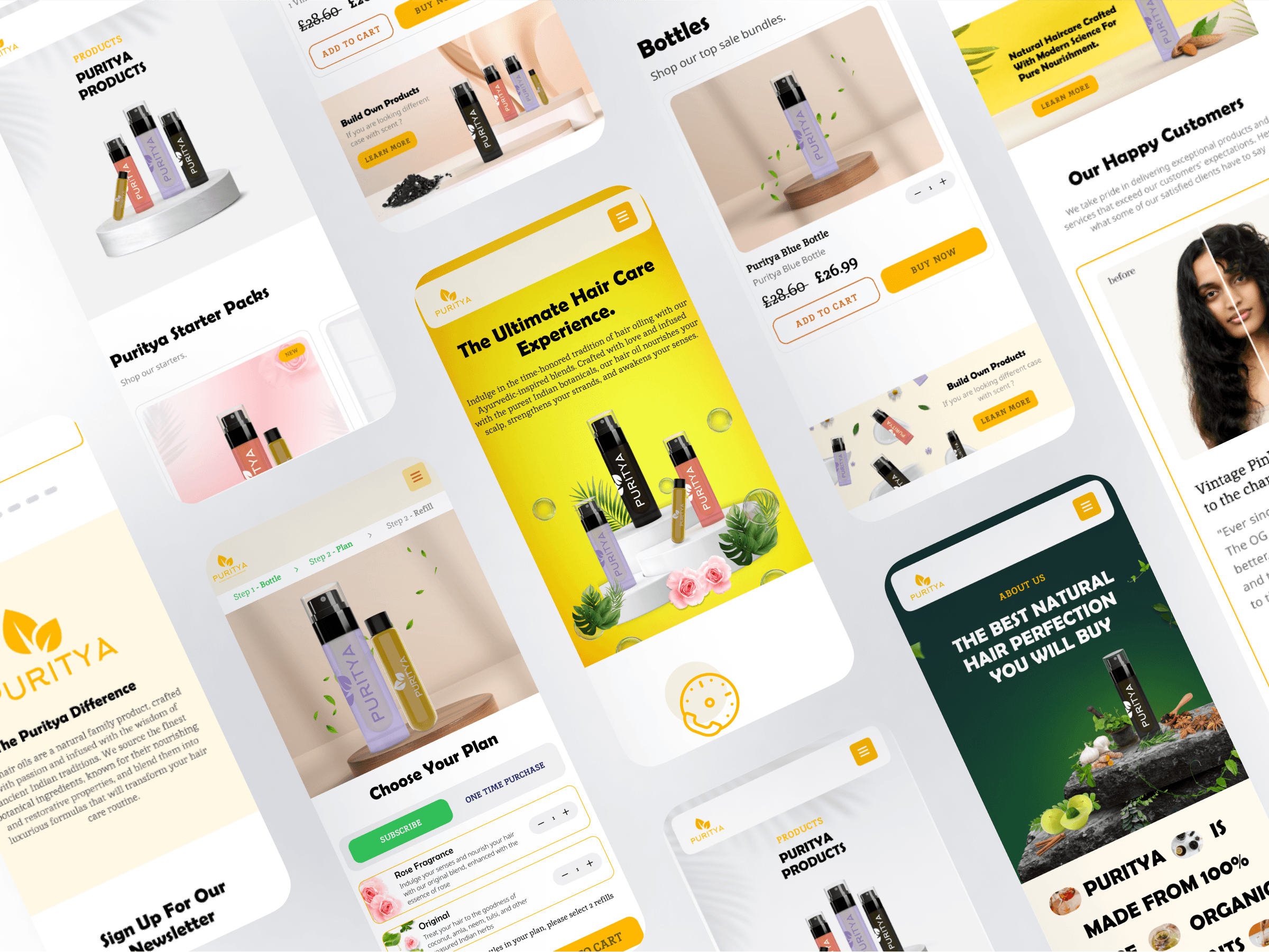
Mobile-First Experience
The redesign prioritized responsive layouts and touch-friendly elements, ensuring a consistent experience across smartphones, tablets, and desktops.
Conversion-Focused Product Pages
We redesigned product pages to be more persuasive and informative—featuring clear CTAs, ingredient transparency, and user reviews to build trust.
Faster Load Times
Performance enhancements were implemented across the board, reducing page load times and improving overall usability.
Conclusion
Puritya’s redesign is a testament to how strategic updates can breathe new life into an existing platform. With an elevated visual design, simplified navigation, and a performance-first approach, the new Puritya experience inspires confidence, promotes wellness, and supports business growth—while staying true to its roots.